Pantone Color of the Year 2026: Inspires Your Next Design
Every year in early December, Pantone announces its Color of the Year. This is something designers and print-on-demand entrepreneurs eagerly anticipate, as understanding color trends can inspire product design and the development of best-selling items. Today, let's explore the aesthetic trends behind Pantone Color of the Year 2026 , which may inspire your next design endeavor.
What is Pantone color of the year?
Pantone is one of the world's most professional companies specializing in color research. Every December, the Pantone Color Institute studies global trends in fashion, art, technology, politics, travel, and even collective emotions. From these complex factors, they extract a color that represents the emotional tone of the world. You can think of it as expressing what is happening in the macro-culture through the language of color . This is the Pantone color of the year .
This selected color will then permeate design, branding, interior design, packaging, marketing campaigns, and of course, printing on demand.
This wasn't a random choice; rather, it's more of a reflection of the spirit of the times, using a certain color to reflect how we feel at this moment… or how we hope to feel. Once released, this color typically becomes the star color in fashion color schemes and product launches over the next twelve months.
What is the Pantone color of the year in 2026?
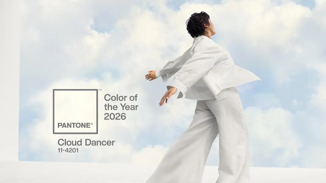
Amidst much anticipation, Pantone announced its 2026 Color of the Year as Cloud Dancer, officially designated PANTONE 11-4201. This is a shade of white, marking the first time Pantone has chosen white as its Color of the Year since 1999.
According to Pantone, Cloud Dancer is a lofty white color that symbolizes the power of tranquility as society rediscovers the value of contemplation and meditation.
Unlike the various shades of white in the fashion world, Cloud Dancer is somewhat like the white of flowing white feathers and clouds. Leatrice Eiseman, executive director of Pantone, said the color is "related to new beginnings" and "symbolizes our desire to start afresh."
How does Pantone choose the color of the year?
Pantone's color selection process is a complex undertaking, integrating knowledge from multiple disciplines including psychology, art, and sociology. First, their team monitors global trends, researching trends in fashion, home and architectural design, technology, and entertainment. They also use cultural and emotional interpretation to identify emotional patterns: do people crave peace, rebirth, joy, courage, or escapism?
Pantone brings together color experts from different continents. In these private, closed-door meetings, experts discuss which color best captures the spirit of the times. This color must be able to resonate across language, market, and cultural boundaries.
At the same time, they must also consider and evaluate whether the color is versatile enough for practical applications; it must be both contemporary and timeless. Once a color is chosen, Pantone carefully crafts a story explaining why that color represents the current emotional climate in the world.
How to incorporate the 2026 color of the year into your designs?
Regardless, Cloud Dancer will undoubtedly be used in various design scenarios in 2026. If your work is related to design, now is not the time to discuss whether the color of the year is appropriate, but rather to think about how to design the next amazing piece using this color.
How to choose the color scheme for Cloud Dancer?
Cloud Dancer is a soft, warm, and translucent white. It's not a harsh, "hospital white," nor is it an overly creamy white; rather, it's a white with a touch of warmth and an airy feel, as if somewhere between morning mist and cotton. Although Pantone doesn't publicly disclose the exact RGB values, you can refer to the following approximate values:
- RGB: 242, 240, 235
- HEX: #F2F0EB
- CMYK: 4 / 4 / 8 / 0
White is the ultimate neutral color, pairing perfectly with almost any hue. However, Cloud White is not just ordinary pure white. It's warm and soft, suitable as a base color or accent color in design. Trying it with the following colors might yield even better results:
- Sage green: Subtle, nature-inspired contrast
- Dusty pink: Soft, romantic undertone
- Latte brown: Warm, cozy accents
- Navy or deep indigo: Striking contrast without overpowering
- Terracotta: Earthy warmth for minimalistic designs
- Metallic gold: Adds luxury and elegance
Inspiration from Cloud Dancer's applications in different products
T-shirts
Cloud Dancer combines soft, pure cotton fabric to create high-quality custom T-shirts. You can experiment with simple line drawings, abstract shapes, or geometric patterns for a clean and elegant look. Alternatively, use botanical illustrations or soft watercolors to complement the white tones for a serene effect.
Tote bags
Tote bags have always been a popular item for print-on-demand , and some off-white tote bag designs have been very popular in the market. Cloud Dancer shares a similar aesthetic with off-white. If you own a lifestyle brand, trying some minimalist line art designs might yield good results, appearing sophisticated and elegant against a bright white background.
Mugs
The soft white background of Cloud Dancer makes text design easy to read and visually appealing. Using Cloud Dancer as the background color for a design, paired with meaningful text, can give the mug an elegant feel, making customers more willing to buy the product .
Baby clothing and accessories
Cloud Dancer's soothing hues convey a message of safety, comfort, and purity. It's perfectly suited for baby clothing design, instantly evoking feelings of comfort and calm. This is incredibly appealing to parents.
Canvas painting
Cloud Dancer's pale white color creates a quiet space, giving it a natural advantage for minimalist canvases. You can design large Cloud Dancer backgrounds, paired with lime gray, subtle cloud textures, and simple mountain shapes, creating an effect reminiscent of a breeze blowing in from outside.
Using Cloud Dancer for brand promotion and marketing
Cloud Dance is more than just a color; you can use it to shape your brand image. This color inherently conveys a sense of calm and renewal, giving it an inner strength and elegance. If your brand leans towards mid-to-high-end and minimalism, you can absolutely use Cloud Dance as your brand's base color and build your brand's visual assets around it.
- Main visual effect: It can be used as a background for product photography or website banners.
- Social media feeds: Use Cloud Dancer as a unified theme to create a consistent Instagram or Pinterest aesthetic.
- Product Model: Showcase your design against a pure white background to highlight details.
- Logo embellishment: Soft white complements the brand's main color scheme, giving the brand a calm and modern feel.
What were the color of the year in previous years?
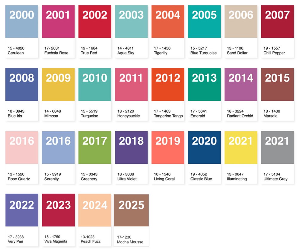
Looking for inspiration from past Pantone Colors of the Year? To make things easier, we've compiled a sheet below listing Pantone's annual Colors of the Year:
| Year | Color Name | Pantone Code | Notes |
|---|---|---|---|
| 2025 | Mocha Mousse | 17-1230 | Warm, understated brown with a quiet-luxury mood. |
| 2024 | Peach Fuzz | 13-1023 | Gentle, comforting peach tone. |
| 2023 | Viva Magenta | 18-1750 | Bold crimson-red that celebrates self-expression. |
| 2022 | Very Peri | 17-3938 | A dynamic blue-violet created for the digital era. |
| 2021 | Ultimate Gray & Illuminating | 17-5104 & 13-0647 | A resilient gray paired with a bright, hopeful yellow. |
| 2020 | Classic Blue | 19-4052 | Dependable blue conveying calm and stability. |
| 2019 | Living Coral | 16-1546 | Warm, lively coral with a human touch. |
| 2018 | Ultra Violet | 18-3838 | Deep purple tied to imagination and creativity. |
| 2017 | Greenery | 15-0343 | Fresh yellow-green representing renewal. |
| 2016 | Rose Quartz & Serenity | 13-1520 & 15-3919 | A pastel duo balancing warmth and tranquility. |
| 2015 | Marsala | 18-1438 | Rich, earthy wine red with sophistication. |
| 2014 | Radiant Orchid | 18-3224 | Expressive purple with dreamlike charm. |
| 2013 | Emerald | 17-5641 | Lush, radiant green symbolizing growth and harmony. |
| 2012 | Tangerine Tango | 17-1463 | Dynamic orange-red full of movement. |
| 2011 | Honeysuckle | 18-2120 | Energetic pink with vitality and cheerfulness. |
| 2010 | Turquoise | 15-5519 | |
| 2009 | Mimosa | 14-0848 | Warm, uplifting yellow for hope and optimism. |
| 2008 | Blue Iris | 18-3943 | Mysterious, elegant blue-violet. |
| 2007 | Chili Pepper | 19-1557 | A spicy, dramatic red with strong presence. |
| 2006 | Sand Dollar | 13-1106 | Soft beige reflecting simplicity and grounded comfort. |
| 2005 | Blue Turquoise | 15-5217 | Serene, nature-inspired turquoise. |
| 2004 | Tigerlily | 17-1456 | Vibrant orange with a creative and adventurous spirit. |
| 2003 | Aqua Sky | 14-4811 | Refreshing aqua tone symbolizing tranquility. |
| 2002 | True Red | 19-1664 | A powerful and passionate red. |
| 2001 | Fuchsia Rose | 17-2031 | Bold, energetic pink representing confidence. |
| 2000 | Cerulean | 15-4020 | A calm, optimistic blue to welcome the new millennium. |
FAQs
Will people like Cloud Dancer?
Yes. Cloud Dancer arrives at a moment when consumers are craving calm, softness, and visual clarity. This gentle, natural white feels clean without being cold, and its versatility makes it appealing across home décor, fashion, and digital-first aesthetics. For buyers who want their spaces to feel airy, grounded, or quietly luxurious, Cloud Dancer fits that mood perfectly. Its neutrality also means it works with nearly any palette, which increases its mass-market appeal. Whether your audience prefers minimalist interiors or subtle, cozy tones, Cloud Dancer has the kind of universal charm that tends to perform well in both retail and POD marketplaces.
Can I launch a new design collection using the 2026 Color of the Year?
Absolutely. In fact, aligning a product line with the Pantone Color of the Year is a proven way to capture trend-focused shoppers and boost search visibility. Cloud Dancer offers a strong foundation for multiple categories: canvas prints, apparel, stationery, lifestyle goods, and even personalized products. You can build a full collection around it or use it as the base tone for typography, abstract art, line illustrations, or photo enhancements. Because it works with warm neutrals, metallics, pastels, and deep accent colors, you can shape the collection to suit minimalist, Nordic, luxury, or soft-wellness styles. Launching early in the trend cycle positions your brand as forward-thinking and design-aware.
What makes Cloud Dancer different from other whites?
Cloud Dancer is not a stark, clinical white. Its charm lies in its softness: a balanced, breathable white that feels more like diffused daylight than polished porcelain. It has a subtle organic quality, giving it warmth without drifting into cream or beige. This makes it more forgiving in prints and on textured materials, especially canvas, fabric, and matte finishes. Unlike bright whites that can feel harsh, Cloud Dancer invites calm, openness, and quiet sophistication. It’s neutral, but not empty; light, but not cold; simple, but with emotional depth—qualities that set it apart from the typical “pure white” used in mass-market design.
Conclusion
Pantone's 2026 Color of the Year, Cloud Dancer, is more than just a trend; it's an invitation for creators to design with calm, clarity, and elegance in mind. For POD sellers, it offers a versatile, safe, and highly appealing canvas that can elevate products and store visuals.