Top 2026 Spring Color Trends for Your Custom Apparel Brand
The gentle spring breeze not only brings warmer temperatures but also awakens a strong desire in consumers to refresh their wardrobes. After a long, visually dull winter, people are eager to express the vitality of the new season through fresh, bright colors. For the print-on-demand and custom apparel industry, color is the primary visual element; it's the "number one driving force" that captures customers' attention and triggers impulse purchases. In this guide, we will provide an in-depth breakdown of the must-have core color trends for custom apparel in spring 2026, teaching you how to use the most eye-catching color combinations to create your next spring bestseller!
The Must-Have Spring Color Palette for 2026
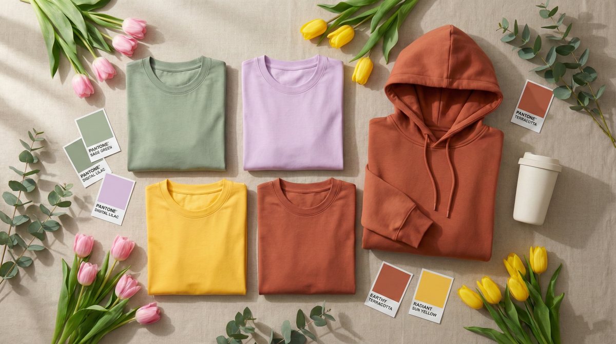
Bidding farewell to the dark and heavy tones of winter, spring colors focus on emotional value and natural revival. For custom apparel brands, the following four core colors will be your ultimate traffic-driving secret for this season's new arrivals:
Digital Mint & Sage Green
Greens are always the undisputed stars of spring, and in 2026, low-saturation hues are replacing high-saturation ones. The more breathable Digital Mint and Sage Green are taking the place of the highly saturated emerald greens of the past. These colors, sitting comfortably between nature and digital technology, consistently offer a calming, healing, and eco-friendly visual experience, making them increasingly popular among consumers.
These soft colors are perfectly suited for outdoor lifestyles, botanical illustrations, or minimalist line-art designs. It is worth mentioning that when Sage Green is applied to high-quality, opaque, 100% cotton fabrics, it highlights the brand's premium feel and retro vibe even more. Many heavyweight vintage T-shirts are beginning to adopt these color applications.
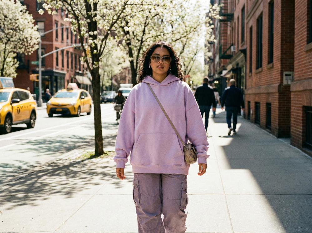
Soft Lavender & Digital Lilac
With its built-in dreamy filter, Digital Lilac is taking Gen Z wardrobes by storm. This is also one of my personal favorite colors; in my opinion, it carries both a retro Y2K vibe and a touch of futurism. To a certain extent, it perfectly aligns with the current consumer psychology of young people seeking individuality and spiritual resonance.
Soft Lavender, on the other hand, is the perfect background color for "Positive Typography" or retro-futurist graphics. In print-on-demand apparel, you can try applying this color to lightweight spring hoodies or drop-shoulder T-shirts. Paired with psychedelic typography, it is highly likely to become the next streetwear hit.
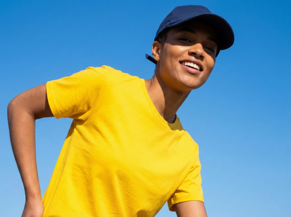
Radiant Sun Yellow
Radiant Sun Yellow is the absolute driving force behind "dopamine dressing" in the 2026 spring color palette. If Digital Mint and Sage Green are introverted, then this bright, warm yellow represents optimism and vitality. They can instantly grab consumers' attention, making them especially suitable for Spring Break and early summer transition marketing campaigns.
As a highly visually impactful base color, Radiant Sun Yellow doesn't require overly complex designs. It is exceptionally well-suited for color-blocking. For example, Ultra Violet and Radiant Sun Yellow are complementary colors, and this pairing delivers the strongest visual impact; even simple geometric lines can create a modern feel that is both mysterious and avant-garde. Alternatively, pairing it with navy blue creates the ultimate contrast between cool and warm tones, making the overall visual steady yet lively, which is perfect for retro or athleisure brands.
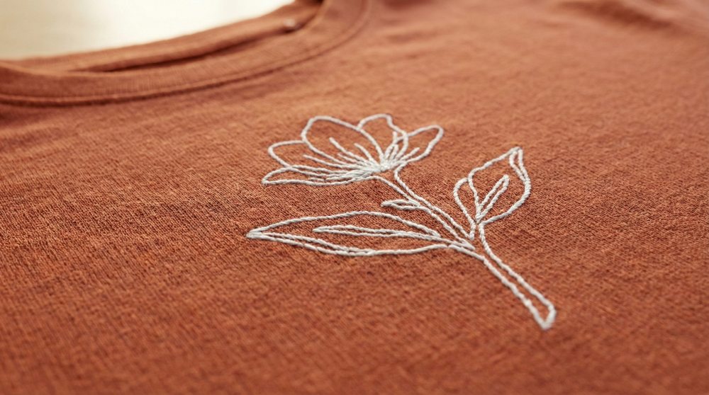
Earthy Terracotta & Warm Sand
Beyond pastel macaron colors, understated earthy tones like Terracotta and Warm Sand still hold an important place in the 2026 spring color palette. They offer the perfect transitional option for consumers who lean towards minimalism and unisex styles.
The most prominent feature of earthy tones is their incredible versatility, acting as the ultimate universal canvas. You can pair them with hand-drawn cafe-themed graphics, or use them as base colors for couple or family matching outfits. This warm, rustic lifestyle aesthetic is the top choice for most apparel brands building around an eco-friendly, sustainable concept.
How to Apply Spring Trends to Your Custom Apparel
Mastering the core spring color trends of 2026 is only the first step. To truly translate these colors into a steady stream of orders for your store, you also need to know how to pair them with the right canvas (base garments) and clever graphic layouts. Here is a practical design guide we've prepared to help you create spring bestsellers:
Choosing the Right Canvas
In the print-on-demand space, you have to treat apparel as the canvas for showcasing your design talent. And the final color presentation of your design largely depends on the material and thickness of the fabric. Although temperatures rise in the spring, there are still significant temperature drops in the mornings and evenings. For bright or soft colors like Digital Mint and Digital Lilac, if the base shirt is too thin, it can easily look cheap and see-through. Therefore, choosing high-quality, pure cotton fabrics with a certain weight is crucial. High-quality base garments allow colors to appear more vibrant and premium.
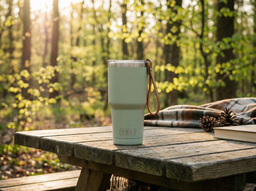
Choosing the right canvas isn't just limited to apparel. Spring is a booming season for outdoor activities, so you can also apply the aforementioned Radiant Sun Yellow or Sage Green to spring travel mugs and stainless steel thermoses. Having these coordinate with your apparel line is an excellent cross-selling strategy.
Design Pairing Strategies
Once you've chosen your base shirt color, how should you design your printed graphics to maximize visual appeal? You can try the following three tried-and-true pairing strategies:
Monochromatic
Monochromatic design is a minimalist, premium approach highly favored by independent brands in recent years. Its core lies in pairing different shades of the same color family.
Print dark purple retro Serif Typography on a Soft Lavender hoodie; or use dark green minimalist botanical illustrations on a Sage Green T-shirt. This combination is not only extremely soothing visually, but it also has a very high margin for error.
Color Blocking
If your focus is on streetwear, retro athleisure, or targeting young Gen Z audiences, color blocking is the ultimate weapon for catching eyes.
Use Radiant Sun Yellow as the base color, paired with classic retro navy or deep violet patterns. This striking contrast can grab a viewer's attention in seconds, making it perfect for expressive brand logo variations or vintage American illustrations.
Negative Space
Spring fashion is all about "breathability," and the same goes for design. You don't need to cover the entire garment; clever use of negative space can often achieve a lot with very little.
On earth-toned base shirts with natural elements, like Terracotta or Warm Sand, use only pure white or pure black fine Line Art. Whether it's a hand-drawn monochrome coffee cup, abstract facial lines, or a small chest embroidery-style print, they all perfectly match the relaxed, cozy lifestyle of spring.
Trending Design Themes to Match Spring Colors
Having a beautiful base color isn't enough; resonant printed designs are the deciding factor that gets customers to add items to their carts. Combined with the 2026 spring color trends, the following three design themes are set to explode:
Retro Botanicals
Blooming spring flowers is a timeless classic theme, but in 2026, it is taking on a distinctly retro vibe. Ditch the realistic, detailed flowers and pivot towards 70s-style bold floral outlines, wild mushroom graphics, or watercolor botanical illustrations. Printing these retro botanical patterns on Sage Green or Terracotta base shirts instantly creates a "cottagecore" lifestyle vibe that longs for nature and embraces the outdoors.
Positive Typography
Consumers are increasingly leaning towards expressing self-care and optimism through their clothing. Phrases carrying psychological cues and emotional value, such as "Good Energy," "Grow at Your Own Pace," or "Embrace the New," will have massive market appeal. Combine these with Wavy Fonts or retro bubble letters, and apply them on Digital Lilac or Radiant Sun Yellow. This pairing is incredibly well-suited for TikTok or Instagram promotions, and it radiates positive spring energy.
Y2K & Retro-Futurism
The heat around Y2K fashion shows no signs of cooling down in 2026. Pixel art, gradient grids, metallic star patterns, or psychedelic Acid Graphics remain highly attractive to younger generations. Digital Lilac is the soul base color for this theme. You can try layering patterns with highly saturated contrasting colors (like bright pink or neon green) on a purple base shirt to create highly recognizable, cyberpunk-inspired spring streetwear.
Prepping Your Store for the Spring Rush
As the peak spring sales season approaches, it's time to give your print-on-demand store a "spring cleaning." Check against the following list to ensure your brand is ready for a surge in orders:
Refresh Spring Visual Assets: Update your store's homepage banner and social media headers. Use lifestyle-oriented images featuring the 2026 trendy colors to replace those heavy, dark winter visual elements.
SEO Keyword Overhaul: Review your existing product titles and descriptions. Naturally integrate trending spring search terms, such as "spring break outfits," "outdoor adventure essentials," "Easter gift ideas," along with specific color terms (e.g., "sage green graphic tee").
Use Mockups for Quick Testing: Don't wait until spring actually arrives to start launching new items. Log into your PeaPrint account right now and use our Mockup Generator to apply your spring designs to differently colored apparel. Post these mockup images on social media for A/B testing to see which colors and patterns your followers react to the most.
FAQs
How can I ensure that the vibrant spring colors I see on my screen print onto clothing without color discrepancies?
This is the most common issue in custom apparel. Screen displays use the RGB color mode, while actual printing uses the CMYK mode. To get the best printing results, we recommend setting your files to CMYK mode in your design software for previewing. Furthermore, choosing high-quality fabrics and utilizing PeaPrint's advanced printing technology can maximize the reproduction of the richness and detail of these trending colors.
Besides T-shirts and hoodies, what other POD products can these spring colors be applied to?
Spring colors have a massive range of applications! As temperatures rise and outdoor activities increase, you can apply these colors (especially Sage Green and Terracotta) to custom drinkware (like outdoor travel thermoses and mugs) as well as canvas tote bags. This not only expands your product line but also encourages customers to buy "spring outing bundles," effectively increasing your average order value.
When should I start listing my 2026 spring colored apparel?
For the print on demand business, planning ahead is key! We recommend that you start adding products featuring trending spring colors to your store between late January and mid-February. This not only gives search engines (SEO) enough time to index them, but it also allows consumers who are looking to buy spring outfits and Spring Break gear early to discover your products sooner.
Conclusion
Rather than passively waiting for the seasons to change, it's better to take the initiative and use this spring color palette to awaken your store's vitality. Don't let these brilliant inspirations stay on paper! Head over to the PeaPrint product catalog right now, pick out your favorite high-quality T-shirts, hoodies, or other outdoor products, select the most eye-catching spring colors, and upload your exclusive designs. This spring, make your brand's colors the most beautiful scenery on the streets!