30 Best Fonts for T-shirt Design: Pick The Right Ones for Your Designs
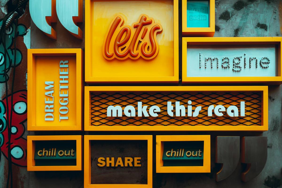
Are you struggling to choose the right fonts for your T-shirt designs? Finding the perfect font pairings can be a time-consuming and tedious task. That's why we've curated a list of the 30 best fonts for T-shirt design, along with carefully selected combinations to match them. Bookmark this list—the next time you find yourself running low on inspiration, these combinations might just help you create stunning T-shirts that boost your sales.
30 Fonts for designing shirts
| Design Style | Hero Font | Pairing Font | Visual Vibe & Best Niches |
|---|---|---|---|
| Streetwear | Bebas Neue | Montserrat | Classic streetwear. High-energy, bold, and clean. Best for skate, hip-hop, and urban apparel. |
| Heavy Harajuku | Dela Gothic One | Inter | Ultra-bold, flat, and high-density Japanese street culture. Perfect for edgy, youth-centric graphic tees. |
| 70s Groovy | Shrikhand | News Cycle | Psychedelic, thick, and retro curves. Perfect for rock bands, vintage aesthetics, and colorful hippie vibes. |
| Y2K Bubble | Titan One | Poppins | 3D puffy, playful cartoon look. Ideal for millennium nostalgia, acid graphics, and pop culture merch. |
| Collegiate | Graduate | Roboto Bold | Timeless American campus style with slab serifs. The go-to choice for sports teams, gym wear, and university merch. |
| Quiet Luxury | Playfair Display | Montserrat | High-contrast, elegant serif. Best for high-end boutique fashion, wedding merch, and minimalist typography. |
| High Impact Slogan | Anton | Open Sans | Ultra-bold, condensed sans-serif. Designed to shout. Best for loud statement tees, political quotes, and activism. |
| Heavy Athletic / Racing | Archivo Black | Archivo Narrow | High-contrast clash of ultra-wide and compressed weights. Full of speed, power, and racing energy. |
| Comic & Meme | Luckiest Guy | Poppins | 1950s retro newspaper ad style. Perfect for funny memes, pet shirts, and relatable dad jokes. |
| Indie Tech / Avant-Garde | Space Grotesk | Lora | Modern tech sans-serif with distinct ink-traps. Best for indie labels, underground art, and techno music scenes. |
| Vintage Americana | Cooper Black | Roboto | Warm, chunky, and rounded serif. Instantly gives a coffee shop, vinyl record, or 70s nostalgic lifestyle feel. |
| Tactical / Techwear | Oswald | Lato | Narrow, tall, and rigid with a mechanical touch. Best for gym wear, tactical gear, and hardcore outdoor apparel. |
| Distressed Typewriter | Special Elite | Merriweather | Authentic weathered typewriter texture. Ideal for book/movie quotes, indie aesthetics, and dark humor. |
| Industrial Block | Bungee | Roboto Condensed | Heavy, brick-like street font that dominates visual space. Perfect for bold box-logo layouts and structural designs. |
| California Surf | Pacifico | Figtree | Flowing, bold, and sun-drenched script. Excellent for beachwear, summer aesthetics, and West Coast lifestyle brands. |
| Neo-Modernism | Neue Montreal | Garamond | A high-fashion clash between neutral neo-grotesques and classic Roman serifs. Runway merch vibes. |
| Graffiti & Skate | Permanent Marker | Roboto | Raw, aggressive marker-stroke aesthetic. Perfect for skateboarding brands, underground rap, and raw street style. |
| Editorial Elegant | Cormorant Garamond | Work Sans | Razor-sharp, ultra-thin luxury serif with royal elegance. Best for aesthetic, minimalist, and upscale women's apparel. |
| Magazine Retro | League Spartan | Libre Baskerville | Hard, heavy geometry clashing with traditional editorial serifs. High-impact look for editorial and fashion blogs. |
| Cozy Handdrawn | Patrick Hand | Josefin Sans | Warm, friendly, and organic handwriting. Perfect for family reunions, eco-friendly merch, and cute illustrations. |
| 8-Bit Geek | VT323 | Crimson Pro | Retro Nintendo NES pixel font. Tailor-made for retro gamers, programmers, geeks, and nerd culture. |
| Web3 Futuristic | Unbounded | Albert Sans | Ultra-wide, flat, sci-fi layout. Best for tech startups, crypto/AI merchandise, and EDM music festivals. |
| Moto & Off-Road | Chivo | Unica One | Heavy-duty industrial steel aesthetic. Best for motorcycle clubs, 4x4 off-roaders, and garage mechanic themes. |
| Sweet Candy | Bubblegum Sans | Caveat | Plump, sugary, and adorable look. Best for toddlers' clothing, children's apparel, and cute kitten/puppy merch. |
| Cyber Gothic | Fayte Pixel | Inter | Jagged pixel edges meet dark gothic layouts. Best for techno raves, darkwear, and niche alt-streetwear. |
| Rockabilly Retro | Lobster | Montserrat | Dynamic, heavy script with a vintage pulse. Perfect for custom car culture, hot rods, and retro rock 'n' roll. |
| Avant-Garde Minimal | Wire One | Montserrat Regular | Elongated, needle-thin lines. Works beautifully when layered over complex All-Over Print (AOP) graphics. |
| Sustainable Organic | Alegreya | Alegreya Sans | Warm, organic serif with subtle hand-crafted touches. Best for vegan lifestyles, eco-apparel, and botanical art. |
| Heavy Metal | Metal Lord | Arial | Sharp, aggressive death-metal blade typography. Perfect for band merch, hardcore rock, and edgy alt-fashion. |
| Experimental Psychedelic | Megrim | Nunito | Broken lines and abstract geometry. Best for trippy art, psychedelic trance music merch, and abstract concepts. |
Why Font Choice Makes or Breaks Your Design
Thoughtful font selection and pairing can clearly convey the mood or atmosphere of a design. For any given design style, the right font invariably sets the tone. For instance, if you wish to project a sense of strength, bold and robust typefaces—such as Anton or Bebas Neue—are an excellent choice.
Fonts also play a significant role in enhancing a design's legibility. If your text contains important information, you must ensure that the chosen font size is appropriate and that the text does not appear overly crowded.
When selecting fonts for T-shirt designs, legibility and the specific sentiment you wish to convey should be your top priorities.
How to Choose a Font for Your T-Shirt Design
Choosing the right font for a T-shirt is not as simple as finding one that looks cool on a computer screen. This is because font design for apparel requires balancing aesthetics, legibility, and scalability for printing.
1. Match the Typography to the Market
Each font has its own unique personality. Before selecting a font, you must first clearly define the emotion you wish to convey and your target audience:
Streetwear: Requires fonts that are bold, structured, or slightly rugged in style (e.g., heavy sans-serifs, weighty Gothic fonts, or distressed stencil fonts).
Corporate & Promotional Use: Demands exceptional clarity and professionalism (e.g., clean, geometric sans-serifs).
Retro: Utilizes vintage scripts, slab serifs, or fonts featuring built-in textures and variable baselines.
Humorous & Novel: Best paired with casual, lively, or hand-drawn fonts to maintain a lighthearted and approachable tone.
2. Understand the Core Font Categories
Familiarizing yourself with the major categories helps you instantly narrow down your search. The most useful font categories include: Sans-Serif, Serif, Script & Handwriting, and Display. The characteristics of these font categories are as follows:
- Sans-Serif: These fonts appear very clean and modern—like Helvetica or Montserrat—and lack the decorative "feet" (serifs) at the ends of their letterforms. They remain clear and legible even when viewed from a distance, making them ideal for modern, minimalist, or athletic-style designs.
- Serif: These fonts project a more classic and sophisticated aesthetic; typified by fonts like Garamond, they feature decorative strokes that convey a sense of authority, tradition, or high-end luxury.
- Script & Handwriting: Highly distinctive and elegant in style, these fonts mimic cursive or calligraphy to add a personal, human touch; however, excessive use can make them difficult to read. It is recommended to reserve them for short, impactful words only.
- Display: Primarily comprising bold and thematic typefaces, these highly stylized fonts (such as the dripping-ink style seen in horror movies or the typefaces found on "Wanted" posters from the Old West) are designed specifically for large-scale use. Please use them exclusively for main headlines.
Study the Rules for Pairing Fonts on T-Shirts
How to flexibly apply these fonts is the most crucial part. Here are some basic principles applicable to all T-shirt designs:
1. Build a Clear Visual Hierarchy
Within the scrolling feed of e-commerce content, your key message must instantly grab the viewer's attention. You can designate a primary typeface, typically a bold or heavy sans-serif font, for your main headlines or images. For supporting text, brand names, or finer details, use a different font that is clear and highly legible. The contrast in font weight and size naturally guides the viewer's gaze, directing their eyes from the most critical elements down to the secondary information.
2. Use Only Two Fonts
In apparel typography, strictly limiting the number of fonts to two prevents the garment from looking like a chaotic ransom note. For instance, pair a fluid, expressive script with a bold, geometric sans-serif, or match a heavy, striking bold font with a clean, light serif. If you require greater variety, utilize different weights within the same font family, such as bold and italic, rather than introducing a third distinct typeface.
3. Pay Attention to Spacing
ypography needs room to breathe, especially on a flexible, moving canvas like a T-shirt. Adjust your tracking (overall letter spacing) and kerning (space between individual letters) to ensure readability from a distance. Tight spacing might look fine on a bright monitor, but ink spread during the physical printing process can cause letters to bleed together if they are packed too closely.
4. The Font Should Match the Message
A serious, hard-hitting slogan loses its impact if set in a bouncy, comical script, while a lighthearted joke falls flat in an aggressive, brutalist gothic typeface. Ensure the inherent personality of your paired fonts aligns perfectly with the emotion of the phrase and the specific demographic your merchandise is targeting. The visual tone must reinforce the written word.
5. Test on Fabric
What looks flawless on a flat digital artboard can warp, lose contrast, or scale poorly when applied to a physical garment. Before rolling out a new design across your catalog, order a physical sample or utilize high-quality, draped apparel mockups. This allows you to verify that the ink holds up on the specific fabric texture, that the text contrasts well against the shirt material, and that the font weights remain legible across all sizing tiers.
Where to Find the Best Free Fonts
Are you looking for font resources that offer clear, commercially safe licensing suitable for print-on-demand scalability? The following websites feature thousands of different free fonts:
- Google Fonts
- Font Squirrel
- Fontshare
- Open Foundry
- Befonts
- Font Bundles
- Fontesk
- Freefaces
- UNCUT
- Collletttivo
- Creative Fabrica
- Fonts in the Wild
- Fontspace
- MyFonts
- DaFont
What You Need to Know About Font Licensing
Font licensing is an issue that is often overlooked; however, if mishandled, it can lead to costly takedown notices or lawsuits. It is important to understand that when you download a font, you are not purchasing the font itself, but rather the software; the license serves as the terms of service that govern how you may use that software. Simply put, most fonts fall into one of three main licensing categories.
Personal Use Only: This means you can use the font for personal projects that generate absolutely zero revenue. It is fine for testing out a mockup or designing a birthday card for a friend. It is strictly prohibited for business logos, social media marketing, advertising, or products for sale.
Commercial Use: This allows you to use the font for financial gain, but it is rarely a free-for-all. Commercial licenses almost always come with strict parameters. If you are creating typography-heavy T-shirts, mugs, or posters, you often need an extended license specifically clearing "Products for Resale."
Open-Source / SIL Open Font License (OFL): The safest, most flexible option for a scaling business. Fonts with an OFL (like those found on Google Fonts) are completely free to use, modify, and distribute for personal and commercial use, including on physical merchandise and web pages.
How to Design T-Shirts with Text with PeaPrint
- Want to quickly create text-based T-shirts and start selling them? Here's how:
- Sign up for a free PeaPrint account and connect your store (Shopify, WooCommerce, Amazon, Etsy).
- Select a blank T-shirt from our product catalog and click "Start Designing."
- Upload your own design, or choose from the free font library within our design tool—with over 120 free fonts available.
- Once your design is complete, order a sample to ensure it looks great on the fabric.
- Publish the product to your store to start selling; we'll handle the production, packaging, and shipping for you.
Start designing your own T-shirts with PeaPrint today!
FAQs
What is the best font to use for minimalist text T-shirts?
For high-impact minimalism, Helvetica Neue or Futura are the gold standards. Their clean lines and neutral geometry look instantly intentional and premium on apparel. If you need a 100% free, commercially safe alternative for print-on-demand scaling, go with Inter or Montserrat via Google Fonts.
Does PeaPrint's design tool offer free-to-use fonts?
Yes. PeaPrint's design and creation tools offer over 120 free fonts, all of which are available for use—at no cost—in T-shirt designs for both personal and commercial purposes. There are no per-T-shirt font licensing fees, no subscriptions required, and absolutely no hidden charges; simply select your favorite fonts, complete your design, and you are ready to start selling.
What are the most popular fonts for T-shirt design?
It is difficult to say exactly which fonts are the most popular in T-shirt design; however, fonts such as Bebas Neue, Oswald, Helvetica, Roboto, Arial, and Impact are among those most frequently used on T-shirts. These fonts are clean, versatile, and easy to read, making them perfectly suited for a wide variety of designs.